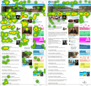
Most of your webpage is irrelevant
Provocative title, yes, but as you can see from the eye tracking heat maps above – when a user lands on a page trying to complete a task, they ignore everything they don’t consider helpful in completing that task.

Left-hand image
The left-hand heat map shows 3 people looking at the start page of a Swedish council’s website without a task. They were just told to take in the page – a test I call first impressions. Without a task, people look everywhere – fixating on headlines, menus, and faces across pretty much the entire page – even scrolling to look below the fold.
Right-hand image
The right-hand heat map shows where 3 people fixated on the same page, but this time they were given a specific task. Their focus is entirely on the horizontal menu. They presumed the menu to provide the next step in completing their task. Everything else was ignored. Nothing else was expected to be able to help more than the main menu.
Normal behaviour
This is not a one off. This is what I see every single time I test a web site where the user has a task to complete. The exact places they look varies with the task, but searching the page for keywords almost always begins with what is perceived to be the main navigation.
How much of your start page is irrelevant and ignored?
