What is my viewport size and pixel density?
In recent years I’ve talked a lot about the importance of measuring the browser viewport (it’s not as big as you think).
The rapid adoption of responsive web design and the launch of devices with high definition screens where a pixel is no longer a pixel have made measuring and understanding the visible real estate available in the web browser crucial.
What is the browser viewport?

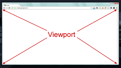
The browser viewport is the size of the rectangle that a web page fills on your screen (or screens!). It’s basically the size of the browser window, less the toolbars and scrollbars. It’s the bit of the screen you’re actually using to show the webpage.
Of course, to us, a screen has a constant physical size, but how the viewport is measured and declared varies from browser to browser.
What is device pixel density?
Starting with the “retina” iPad, we began seeing screens where a pixel was no longer a pixel. A dot on the screen was no longer comparable to “CSS pixel” when developing websites. The “pixel density” of the device started to come into play.
The pixel density ratio is the ratio between physical pixels on the screen (device pixels) and the number of device independent pixels (DIPs) – the pixels you play with in your webdesign. You can read a more in depth explanation on Quirksmode.
When pixels were real pixels, we didn’t need to worry about the pixel density ratio. Now though, there are devices that have a ratio of anything from 1 to 3.
The browser decides
It’s worth noting that it is the browser that decides how many DIPs it reports. So you can find it varies from browser to browser for the same device (the Google Nexus 7 is a good example of this).
The device pixel ratio is theoretically a specific and reliable mathematical relationship (screen width divided by DIPs), but in reality it’s a bit of a wild west.
What is my current viewport size?
The viewport size, as reported by your browser is:
What is my current device pixel density?
The device pixel ratio, as reported by your browser is:
(only reported by Webkit based browsers)
What is my screen size?
The screen size, as reported by your browser is:
Test pages
Quirksmode has a very useful test page that displays a grid as well as some key values often used when creating websites.
Marc Edwards has created a page that outputs the values given by a number of device pixel density tests
Ryan Van Etten has created a tidy little page that displays a range of device and viewport sizes reported by your browser.
Bookmark them all!
Not just for devs
You don’t need to be a developer to make use of this information and the test page.
Understanding how browsers on various devices and computers display your webpage will help you communicate ideas, designs and issues better to developers.
A little bit of technical understanding can go a long way in helping improve the UX of your websites.
What is my viewport size and pixel density? http://t.co/ZASpXtBJQc
— James Royal-Lawson (@beantin) May 5, 2013
