Thin Ice Press workshop


I've just returned from a "Workshop conference retreat" together with Per Axbom and Chris McCann. I'm calling it that as we combined a formal workshop, reflective time to gather thoughts and re-energise, and some structured sessions with a business focus.
The workshop part of our away-trip was a full-day workshop at Thin Ice Press in York. Thin Ice Press is part of The University of York and aims to secure the future of traditional printing—not just preserving the past, but bringing it to life. They do that in a wonderful historic venue, The Old School House in St Anthony's Gardens in York, England.
I first became excited by the idea of attending a letterpress workshop after talking to digital designers who had taken part in a Hacking Gutenberg workshop in Berlin held by Professor Erik Spiekermann.
As I have strong connections to York, being an alum of the university myself, it was really exciting to see that Thin Ice Press had opened its doors in the city centre.
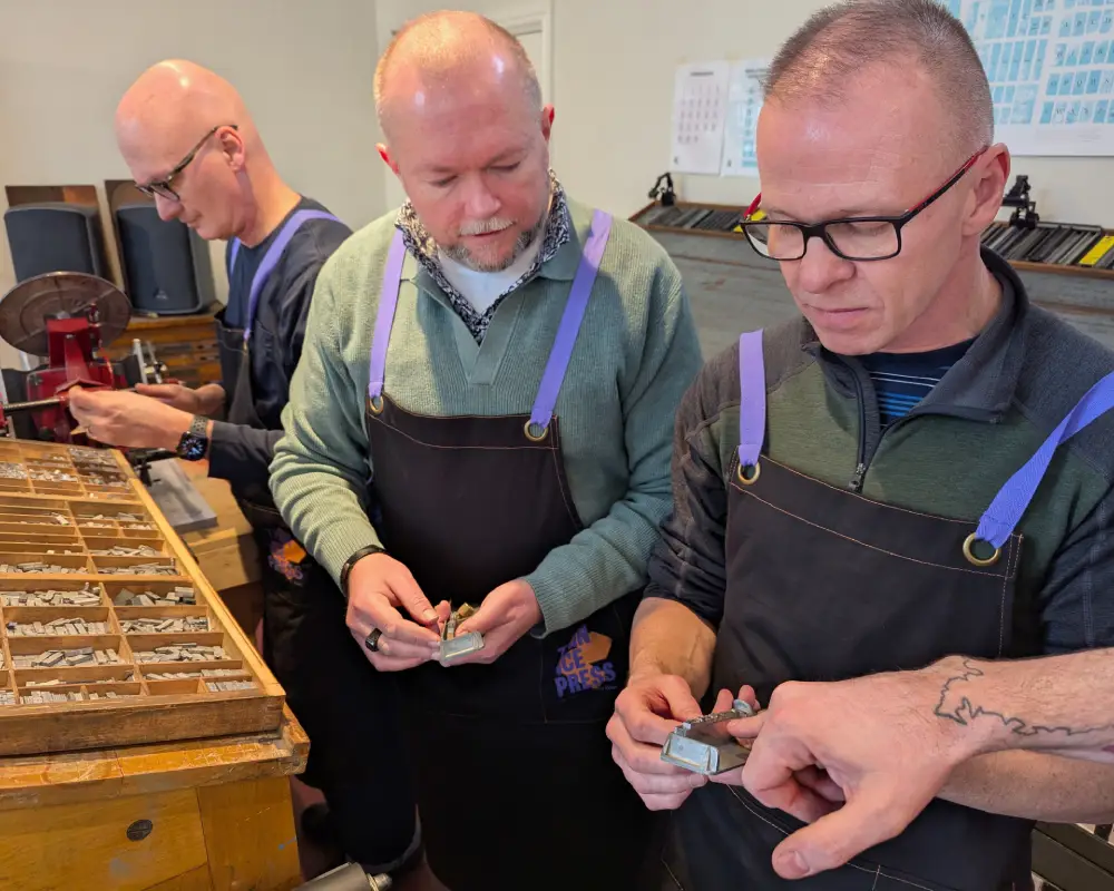
We took part in a workshop led by Helen Smith, the director of Thin Ice Press, Professor of Renaissance Literature at the University of York, and an expert in early books and printing. She was joined by Nick Gill, the Master Printer at Thin Ice Press, who has extensive knowledge of letterpress and bookmaking.
The first part of our day involved learning about the craft of letterpress. Later, we worked on our own unique prints using wood type. We finished the day by folding and binding our own small books using the pages we'd printed earlier.
Learnings from Letterpress
There is a lot of terminology we use in the digital space that originates from traditional printing. Some terms I knew and had connected to printing, but I hadn’t understood their full story.
Uppercase and lowercase, for example. I hadn’t realised that the terms come from the physical arrangement of type: printers placed their sets of letters and characters in two cases—the upper box contained capitals, the lower box contained small letters.
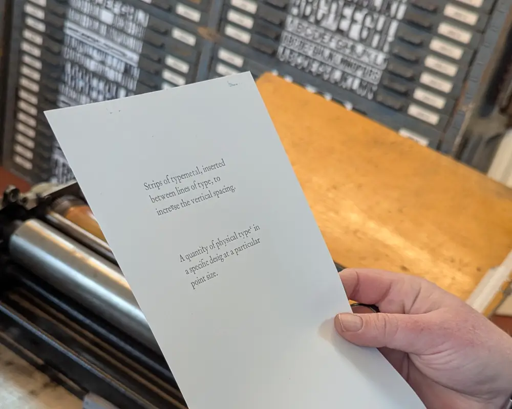
Em and en. I regularly use "em" in digital design for font sizing (essential for creating accessible websites) and understand its relationship to the "base font size" of a system. But I hadn’t fully grasped its origin in traditional letterpress printing. In letterpress, blank metal pieces were used for spacing—these were known as ems (used for word spacing, for example).
I'd also heard of the em-dash and en-dash, which I had thought of (and don't hate me if you disagree!) as just a hyphen (en-dash) and a dash (em-dash). But now, having held the physical metal type in my hands, I understand: an "em" space is as wide as the body of the font, and an "en" space is half that width. These dimensions were historically tied to the width of the M and N letters, respectively.
I also learned that printers call these spaces “muttons” (for em-spaces) and “nuts” (for en-spaces). This terminology is a brilliant accessibility feature—"em" and "en" are difficult to distinguish both visually and audibly, so the alternative names help prevent confusion.
In fact, the "e" in "em" and "en" was originally added to distinguish them from the actual letters m and n—but seemingly even that wasn’t clear enough! Leading to the adoption of muttons and nuts as their nicknames. Wonderful.
Trust the process
One valuable lesson I took away from this experience was how things rarely turn out perfect on the first attempt. Mistakes are inevitable, even when you're careful and focused.
In the piece of text I had to set, I made three initial mistakes:
- I placed a comma upside down (my own doing).
- I missed a letter in a word (again, my fault—talking while working and losing track).
- One letter was from the wrong font (not my fault—it had been misplaced).
- A spacing issue between two words (which was incorrect on closer inspection).
Mistakes were inevitable, but we had to trust the process. The process had been refined over hundreds of years, with guardrails in place to catch errors early.
There were even engineering details that helped—some mistakes could be detected by touch alone. We also performed simple test printing (galley proofs) before committing to the final version.
This is recognisable from an established digital workflow. However, a major challenge in digital work is that our processes aren’t always mature or reliable. Unlike letterpress, where we can trust centuries-old methods, in digital design we're often testing the process while running it.
Even though mistakes were inevitable, and the system was designed to catch them, they were still costly to fix. Correcting our handful of errors took almost as long as preparing the initial draft.
Over time, printers develop a sense of how many mistakes will occur on average, allowing them to plan for errors. This turns inevitable mistakes into manageable risks—a known unknown that can be accounted for.
Behind every printed page lies a history of precision, craftsmanship, and attention to detail. This isn't far removed from all the hidden elements and work that underpin and lie behind whatever digital platform you are reading this text through right now.
PS
A postscript to this article is that observant regular readers amongst you may have noticed that I made use of long-dashes (em-dashes). I don't usually make use of them in my writing, but for this article, it seemed something I just had to do!