The UX divide

Various drafts of this post have been with me for years.
The title has evolved over time as my “answers” to the problem have swung back and forth. The problem itself has undergone several incarnations as I’ve learnt new things and my experiences challenged its definition.
But one thing that has stayed true for this article during the years of “draft-post prison” is that there really is something dividing UX up into different worlds that we find ourselves working in.
Initially I thought it was pretty black and white. There are the organisations that “get” UX and there are the ones that don’t. You could draw it as a simple venn diagram. Us and them. You’re in or you’re out.
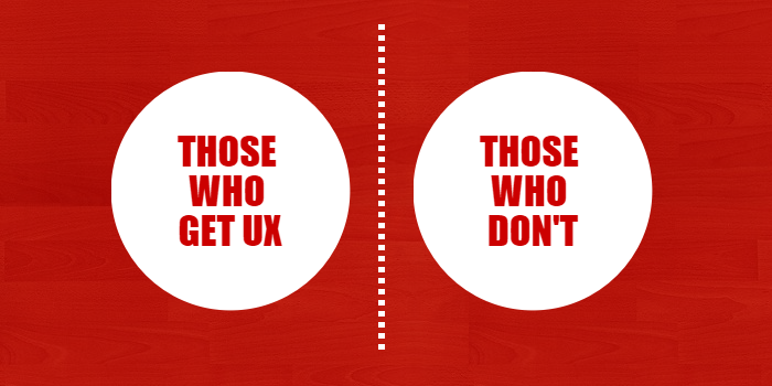
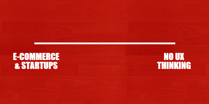
Then e-commerce starts to mature and it becomes apparent that the divide isn’t just those who get UX and those who don’t, but something broader. Those organisations that do e-commerce, those who don’t but get UX and those who just don’t get it. It’s felt linear. A scale from the haves at one end to the have-nots at the other.
E-commerce was where all the cool kids were. E-commerce was where all the conversion optimisation, A-B testing, analytics and creating delight was coming from. Add web-apps and mobile apps to the mix a few years later and we’ve got quite a sizable chunk of people working with UX on that side of the fence.
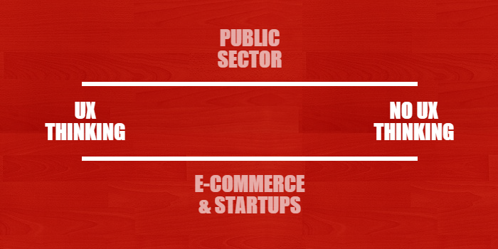
Meanwhile in public sector land there’s a parallel universe forming where some really good, “genuine” UX going on but at the same time some serious disasters. Many of the techniques proven and applied in e-commerce don’t get a look-in.
Public sector employees (and agencies providing digital services) move from one public sector job or assignment to another. E-commerce requires experience of e-commerce. Public sector requires experience of the public sector. An iron curtain comes into the picture.
So now there’s two parallel linear scales in my draft-post.
While this is going on the B2B and corporate world is ploughing on pretty much as it always has. It’s getting inspired and enthusiastic about what’s going on over in e-commerce land, but the budget and the interest from the organisation isn’t really there. The poor UX-er in this organisation has to abandon their career of producing digital delights and instead embark on a 5-year mission to foster organisational change and make their company “get it”. Good luck!
So I add a third line.

At this point I realise that NGOs and charities are missing. The ones I’ve stumbled upon are a strange mix of e-commerce and public sector behaviour. This is not surprising really considering they are not profit-making organisations, but rely on securing funding and obtaining members for their financial survival.
Before I get chance to add a fourth line for NGOs I revisit another draft I’ve had kicking about for years — UX is for big business.
If we throw out the sector-based thinking and look instead a the size of organisations, maybe that gives us a better angle to understand the UX divide from?
Most companies in the world aren’t big. In fact over 99% of companies are not big. Most people don’t work for large companies. Smaller organisations are the ones with very limited budgets and time, A UX-team of one, or perhaps 0.05. Even a small e-commerce company is going to struggle to have the resources to keep their digital machine running in tip-top condition.
So now I’ve got an extra dimension to my four linear scales. I’m not sure this is even possible to sketch in any useful way any more. It’s basically a random collection of made-up lines.
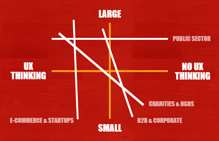
Well, that was a fun illustration but it’s largely fun and not so much fact.
Perhaps after all my “UX Divide itch” was actually just a manifest of UX maturity? So I revisited some of the various UX maturity models and writing that has been published over time.
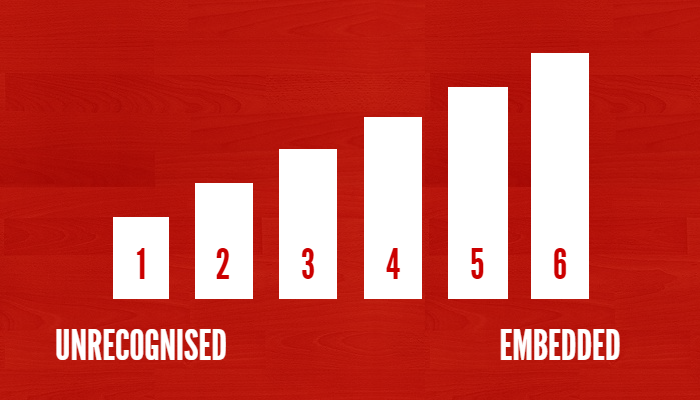
All of our sectors follow the maturity model, although they all have their own “curve” which guides the rate at which they are maturing. If e-commerce is the one with the steepest curve, it means it is pulling away from the others.
I think my divide is starting to fall into place. Organisations sit on different points on the maturity curve. They also have different curves according to business or organisation type. The feeling I have of a UX divide is the difference between the curves at a maturity point.
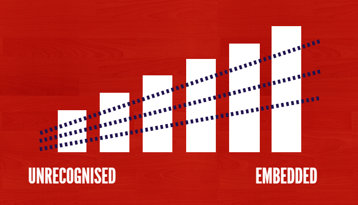
There is still one issue. One thing with the various maturity models is that they all start at the larger end of the organisational scale with phrases such as “UX programs”, “IT departments”, “fully embedded in the organisation”. Our poor old SMEs, especially small ones, don’t follow the same maturity model.
Here I think we see the pull of our sister galaxy, Customer Experience, coming into play.
Smaller companies are closer to their customers, they find it easier to follow the vision of placing the customer at the heart of business.
Whether they are a local bakery or a niche web-boutique, they can hop rapidly between different levels of UX maturity depending on their engagement and understanding of the tools at their disposal.
One day level 6, another level 2.

So how do we add small business to the big picture? We tuck them in close by. Digital is important to them, or it’s not. They get it, or they don’t. They look to the internet and their peers for self-help articles and advice. There is no team or department there’s just them.
Sometimes a small company becomes a larger company and with great power comes great responsibility. They move into the world of UX maturity and get themselves onto a curve.
After all this, have I got an answer to my “problem”? Yeah, kind of. UX is divided. In the same way as we are divided — or rather, unique, complicated, and human. No two of us are the same. We’re different and that’s okay.

There’s an ethical divide as well within UX which is more complex than just whether you design “dark patterns” or work with pay-day loans. Even though the organisations we work with can differ enormously, our individual ethical frameworks differ too. That’s human.
There’s never going to be one universal UX path of righteousness that takes an organisation or an individual from an “aha” moment to user experience perfection. That’s okay too.
As long as we “get it”, maintain our empathy and continue to be facilitators of change, the UX divide of haves and have-nots doesn’t matter.
I’ll leave you with a quote from Whitney Hess, taken from the end of her At the end of her 200 word definition of UX:
User Experience is the responsibility of every member of the organization; it is a central philosophy, shared principles. It is not a series of activities and deliverables to perform, but an enlightened way of being.
UX is mindfulness.
The UX divide http://t.co/zzqc0Jxyzl
— James Royal-Lawson (@beantin) September 9, 2015
Featured image by Dennis Hill
