The journey to a new website

My summer project during the summer of 2023 was to revamp my website.
Well, that's not strictly true. The project of creating this new website started a few years ago. Actually, not even that is strictly true. The work on this particular plan started this year. Work on a website never ends.
Nevertheless, I've made it. I've migrated from beantin.se to beantin.net, and you are reading this on the latest incarnation of my company website.
But the journey to get here hasn't been simple.
Ok, the actual task of moving from beantin.se (which was a WordPress site I launched in 2014, that in itself was a migration project from the Tumblr site I'd had since 2007) could have been very simple.
"Very simple" translates, roughly speaking, into "break lots of things and leave lots of things in a broken state". I could have exported the WordPress content and then imported it as it was into Ghost (the platform I've migrated to - more on that towards the end), shut down beantin.se and launch beantin.net
But that wouldn't have been me. That wouldn't have been close to good enough.
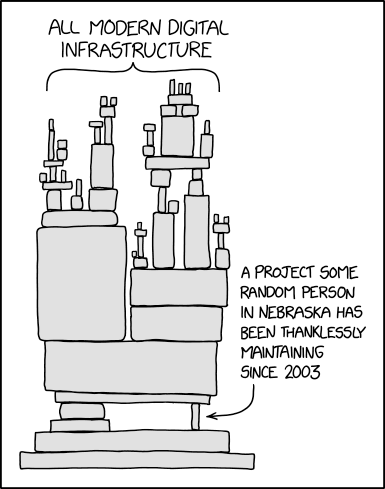
Websites are rarely simple things (any more). They are organisms, woven into the fabric of the internet. It's an entity consisting of links, code, content, structure, history - and to a certain extent in the case of this website; me.
There's also decay. Things that years ago felt like good solutions, now required time consuming work to fix. Like carefully renovating an old building. Peeling back the layers in order to get back to basics and start again.
Like renovating an old building, each time you peel back a layer, you find something else. More surprises. It feels like it will never end. The feeling of anguish grows. Oh, why did I ever start! This really will never end.
Links and redirects
There should be no such thing as a broken link. 404s are an error. They are a bug. They are something you should aim to avoid and if you find them you should fix them. The positive reasons for doing so are numerous, but we can sumerise it as: it's good for the user experience to have links that work.

Often though, we end up in situations with broken links. Things are no longer where they used to be.
Sometimes it's the fault of the content management platform (not helping the publisher or editor sufficently when changing the slug or unpublishing a page).
Sometimes it's the fault of a poorly planned or poorly executed migration between old and new platforms.
Sometimes, even with a planned migration, mapping URLs can be a time (and budget) consuming exercise and eventually a decision to abandon certain links (perhaps ones rarely visited) is made.
But 404s are still an error, and helping clients avoid them is one of my recurring themes. I see it as a user experience issue. If you find a link, click on it, and it doesn't work - that's a poor experience, isn't it?
I think, I've managed to redirect everything. Even a link from 2007 should still work. If you find one I've missed, let me know!
Code
No matter what the platform and no matter what the template, there's always something that isn't quite right. It might be the visual styling of an element, but just as likely (actually, more than likely) there's an accessibility or usability short-coming that should be addressed.
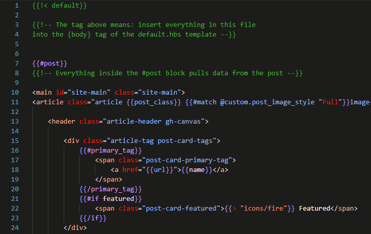
I'd love it to be true that website platforms and their associated templates and themes were always accessible and usable. They aren't. It's all too easy to add content, change settings, or install plugins that make your site less accessible or less usable.
As I can dabble in HTML, CSS and JavaScript, this usually ends up as a massive rabbit hole. The tinkering and tweaking keeps on going. During this migration, a particular source of pain was the way in which the top navigation of this Ghost template behaved. I wasn't happy. I'm still not totally happy, but I've accepted that I've spent enough time on it for now.
Content
Some of the content on this website dates back to 2007. The content on this website has been created in multiple platforms and in different eras, and much of it migrated multiple times.
Back in 2007 I had a separate mobile website (this was 3 years before responsive web design was born). Font sizes were smaller and so were images. In certain posts, content was embedded with scripts (Tweets for example), or iframes.
Outbound links in old articles are often broken (back to the 404 thing again!) and I'd really like to convert those old, broken, links to point to archived versions of the resources I shared, but that is a time-consuming exercise and non-trivial to automate.
There are articles that I'd like to update or revisit. Other articles that I'd like to put some kind of notice on saying that the content isn't applicable any more, and guide the reader to something more useful and relevant instead.
But, as with the code and redirects, a point is reached when you need to stop. For now - work on a website never ends 😉.
Structure
I've worked on some pretty large websites over the years with tens of thousands of pages. I've sat with spreadsheets and information architectures, done tree sorting and tests to find a structure and a categorisation system that would work.
You'd think that a simple company presence like mine wouldn't be that difficult, but as with so many things, once you get into the details it becomes tougher than it seemed on the surface.
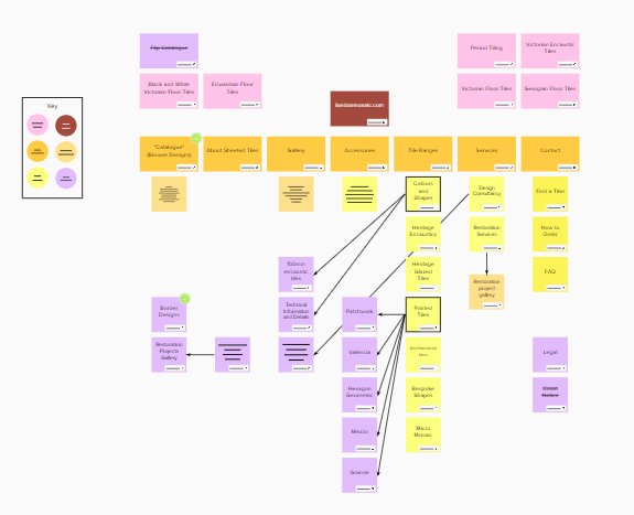
The top navigation is just one aspect of the site's structure. There are also links that are in the site footer. On top of that, there is metadata in the form of tags that are added to each article and pages. Out of those tags, there is a primary tag which gets presented and highlighted on each page.
I wanted to have a collection of tags that could be used as primary article categories - so that every article could be placed in a category. This categorisation task was challenging. Is this article you're reading a Reflection post, or an Anecdote? Another one might be an Analysis, but heavily featuring Analytics.
In the end, my main categories have ended up being a little uneven - some are broad categories such as Anecdote, others are very niche such as Viewport. I did though, avoid having a category called "other".
Self-reflection
The most surprising aspect of working on a new website is the amount of self-reflection that it creates. Who am I? Am I the same person, from a business perspective, as I was a few years ago? How do I want to present myself?
As someone who is self-employed, I don't have anyone else giving me titles. The job title I had 20 years ago (my last one before becoming a consultant) was web responsible. Not responsible for the entire internet, but that particular company's part of it. it was a direct translation of the Swedish title webbansvarig.
It's always been a source of much self-reflection trying to decide the most suitable , current, phrase to describe what I do. Your job "title" as someone who is self-employed is as much a marketing phrase as a communication tool.
Over the years I've shifted from saying "web management" to "user experience" to "designer". I don't think there has been a fundamental shift in what I do or can do, but the right phrase ebbs and flows.
It's something that will always in a certain state of flux. I work in an industry where we can't agree on what UX is, or how it overlaps with UI or CX or product design - or where programmers can be developers, engineers, coders - so it's hardly surprising.
And everyone loves a unicorn 🦄.
Beantin.net
There have been plenty of times when I felt like deleting the whole website and replacing it with just a simple business card site. I really did come close at times. I even made the business card site with Carrd. But that wouldn't be me, or what you expected from me. It would result in this website being a representation of everything I say not to do. Which is hardly a great look for an independent consultant of my experience.
So here we are. Beantin.net running on Ghost. Self-hosted using a combination of Cloudron and Hostup underpinned by Google Tag Manager, Stape, Plausible and at the moment PiwikPRO.
Hopefully, this new platform will mean I rediscover the writing habit which has been lacking in recent years, and I get back to sharing content and knowledge with everyone here.
