Iterating design ideas for SL’s travel planner
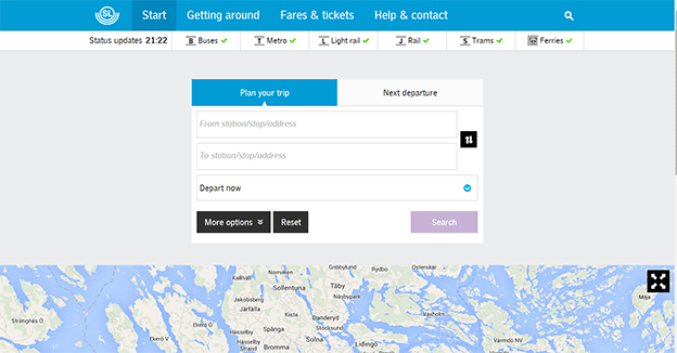
Stockholm Public Transport (Commonly known as SL) launched a new, responsive, website in May 2014. As is often the case with redesigned sites, it has received a fair amount of criticism.
The travel planner in particular has come in for a bit of a bashing, but it’s also received a make-over in the form of two design iterations by enthusiastic experts.
I’m going to throw one further iteration into the ring, demonstrating how much you can achieve with relatively little input and time (but a dash of experience, enthusiasm and skill).
Iteration 0 – SL
Like pretty much every new website launched in recent times, the SL website is of course responsive. Previously they had a separate mobile site.
They’ve also had the courage and honesty to focus on people’s top tasks when visiting the site. The new home page is dominated by service information (delays, cancellations, etc) and the journey planner.
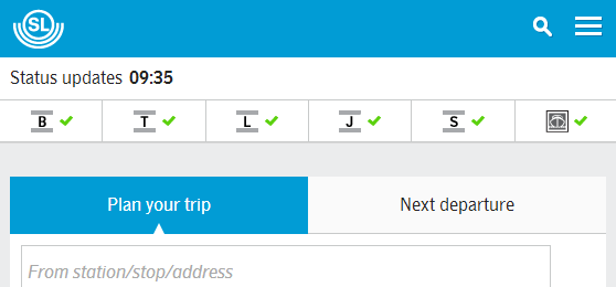
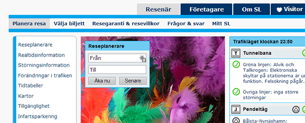
Two functions on the old website have been combined. Previously the travel planner and next departure functions were separate. One was placed within the main image on the page. The other was slightly hidden in the right column, further down.
Combining the two functions is a good idea, but the way in which it has been implemented has been a source of frustration. SL have combined them into the same area by using “tabs”.
Originally the default tab was set to “next departure”. This caused the travel planner to be hidden at first, which was quite a change for a popular and prominent function.
Judging by responses on social media (and users I’ve observed) this has caused confusion (and frustration). “Where has the travel planner gone?!”. Thankfully, SL have changed the default tab to be the travel planner.
SL’s redesigned travel planner

Iteration 1 – John Ekman
John Ekman of Conversionista wrote a constructive blog post born out of his personal frustration and outlined problems he’d spotted with the site and offered some suggestions for improvement.
John highlights that SL should have done a better job of helping users adjust from the old interface (enter two things and press a button) to the new (click somewhere first before you enter your two things and press a button).
When you use tabs, it’s important that they look like tabs so that users understand – points out John. The tab pattern used on the new site is a blue tab with a white box for the content including a little white arrow pointing into the tab.

The solution John proposes is to make the white box blue so that it joins up with the tab to create one large active area, leaving the inactive tab grey which visually gives it a feeling of being “behind”

But wait – you don’t need tabs! John goes further and suggests that the two functions could be combined into the same interface by making the destination field in the travel planner optional.

Page speed
Among the other aspects of the new site John gives attention to is page speed. The responsive solution deployed is a “same content for everyone” solution. Things are just moved around rather than being adapted to suit the use-cases in different contexts.
John highlights how slow the site is on his mobile and lays some of the blame on the map function that is displayed on the start page. A map function that John struggles to see any use for – especially when it always starts zoomed out to show the entire Stockholm area.
Hop! Skip! Jump!
When using the travel planner on a mobile device, John notes how much everything jumps around whilst you are trying to plan. There’s a jump when you give a text field focus. A jump when the incremental search results come in. A jump when you select. A jump when the full search results come in.
As John says, the cognitive load on the user is high as they try to keep up with what’s going on in the interface. The whole process of planning a journey feels like hard work!
Iteration 2 – Per Axbom
Straight on the back of iteration 1, Per Axbom grabbed John’s design suggestions and took them one step further.
Per agrees with John that the tabs are unnecessary and makes the same suggestion of combining them and leaving the destination field blank to perform a “next departure” search.
Leaving at… Arrive by…
If you don’t want to travel right now, SLs travel planner gives you two more options: “depart earliest” and “arrive at” (the copy used on the English version could do with some tweaking…).
Per points out that this is in fact only two options. You don’t need to split it into three. You either want to plan your journey according to the time you want to leave, or plan your journey according to the time you want to arrive. “Now” is just a time, not an option of its own.

It’s only after you’ve chosen an option that isn’t “now” that Per show the fields for choosing a time. Per has turned choosing of a departure time into a dialogue between the user and the form.

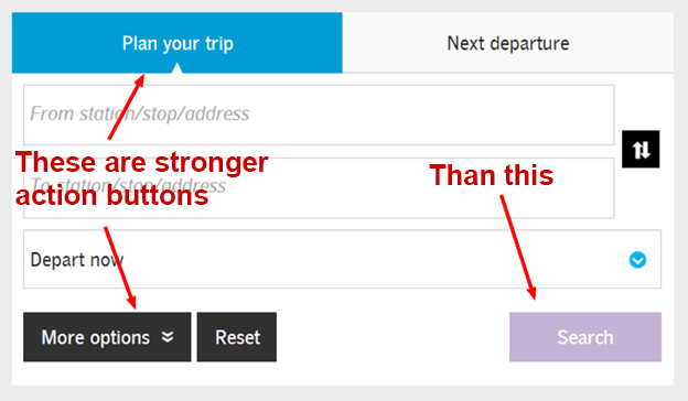
Per makes some other simplifications to the interface and improves the flow. He makes the “search” button a more obvious action button to the form.
Visually, the black “more options” and “reset” buttons are dominating the faint purple button. Per tones down their dominance and puts them below the form within a little “expand” button.

Per’s redesigned travel planner

Iteration 3 – James Royal-Lawson
Both John and Per offered some great insights and ideas. But why stop there? I spent a little bit of time looking at their suggestions and testing SL’s travel planner.
Here are some of my suggestions and improvements.
Speed is king
John complained about the map slowing the site down on a mobile. It’s not the map, it’s something else that’s big but not as visible.

The site includes a javascript file that’s 420KB. It’s not minified and is probably not going to get cached much longer than the current session. The maximum time it will be cached is 6 hours. Which is crazy.
So let’s minify it! This will reduce the size of the payload by just over half to 213KB.
Local storage
We can speed things up even more by using local storage to store the javascript file. Local storage is where web pages and web apps can store data locally on your machine (this data is not transmitted over the internet like cookies, you could say it’s more like a little virtual disk).
This means we could in effect cache the javascript file for all visitors even between sessions and after restarting the phones.
Given the fact that a great number of SL users will be repeat users, this could really speed things up – perhaps by several seconds if you’re checking whilst travelling.
I’d probably look at saving a few more resources in local storage too (such as fonts)
Leaving now?
Rather present time settings from the beginning, I’d go with the TFL option which offers “leaving now” as the default followed by a link to “change time”. Only when you click on “change time” are the date and time options revealed. Progressive disclosure reduces visual clutter.
Primary action button
The tab headings are action texts (“Plan your trip”, “Next departure”. They even look clickable action buttons! I’ve merged them into one function earlier, so we’ve lost them from my design. “Search” is a weak and incorrect phrase in this context.
From a user perspective, we aren’t really searching, we’re showing journeys based on entered criteria. “Plan my journey” is much better as the “action text” on the button.
Get with the flow
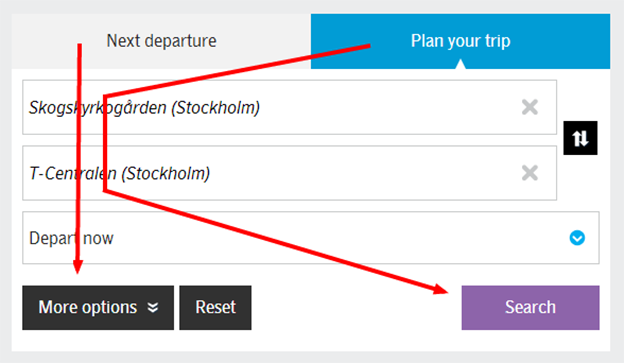
At the moment, the flow is wrong, and in many situations you’re forced to jump sides. Make the “search” button the full width of the container.
By making the button full width, we increase the clickable area. We also negate the need to move your pointer and attention across to the right.
Dump the direction switcher
I’d get rid of the from/to switcher icon on the right. My hunch is that we can meet the “plan my return journey” use case by making use of the location history.
If it needs to stay, then I’d tone it down (and separate the arrows in the icon more to increase clarity!). I’m not a fan of icons on their own, I’d prefer some text to go with the icon.
Definitely a candidate for some split testing!
Save each location
Don’t save entire journeys into the location history; keep them as separate locations.
Having full journeys saved (such as “Skokgskyrkågården to T-Centralen”) makes the list confusing and awkward to use. Keeping them as individual stations/stops would help with return journey planning. You could “switch” by choosing from recent locations.
Consistent functionality across screen sizes
Be consistent between devices. I agree with John that the site should be adaptive and adjust itself to the context of the user. (Rather than just being responsive to the screen size.)
What I don’t understand is why some functionality in the small screen version is removed on the large screen version? The “saved locations” feature isn’t there! I think it’s just as useful on a desktop browser as it is on a mobile. I’m as likely repeat similar searches from all devices, not just the one in my pocket.
My redesigned travel planner for SL
There’s still more things I’d adjust, but this is as far as I got for this blog post…

What can we learn from this?
Iterating design ideas is a healthy process. Feedback is essential to your design cycle, and it doesn’t always have to be usability testing.
Iterate beyond your core group by making use of external brains.
Just look at the input SL have received from three blog posts! The amount of time needed to obtain useful and actionable feedback from industry experts is relatively little.
Design (and interaction design) cannot be separated from the technology it’s built on.
The page loading slowly due to a large javascript file is as important to me, as a UX designer, as the usability problems caused by the non-obvious tabs.
Don’t send your design off to a mysterious and secretive development team. Dialogue should be open.
It should be continuous between all the skill sets needed to produce successful digital services.
You should design (and plan) the migration between versions.
Your users/visitors/customers have to make the journey, so make sure it works and try to make it less painful.
Less pain means more room for happiness! Which translates to good UX and happy customers.
Iterating design ideas for SL’s travel planner http://t.co/IAVHMlF8gQ #ux #ixd
— James Royal-Lawson (@beantin) June 18, 2014