Eventually, you see optimisation everywhere
We all end up being “damaged” in the end. Some might call it “Senior” or “Experienced”, but eventually most of us end up seeing work-related issues in everything around us.
I can’t use a website without noticing something that could be improved. Actually, it’s rare I use a website and don’t end up giving my poor wife a mini-lecture on UX or usability. Poor thing.

Spidey Sense
It doesn’t stop with websites. Most of us who work with producing or optimising digital products and services have a “spidey sense” that tingles constantly. Usually with websites, but just as often it could be a coffee machine, a sign, a door, an entire restaurant – any process or interaction is fair game for our enhanced senses.
We’re constantly optimising what we see.
Take a ticket
I went skiing recently at Kungsberget in Sweden. Nice resort that’s a convenient two hours drive or so from Stockholm.
As usual on arrival I needed to sort out ski-hire for the family. We hadn’t pre-booked (my irritation with the web-based booking system would be a blog post of its own) so we needed to queue.
Sweden is the motherland of queueing systems. Swedes are pretty much born with the instinct to look for a little machine in shops and service centres that dispense a little paper ticket with a number on.

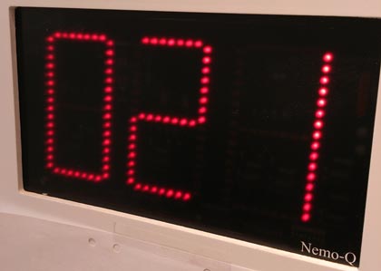
Somewhere else in the store they’ll be a display showing a number (or several numbers…) indicating who’s next in line.
The ski-hire shop at Kungsberget, naturally, has a ticket-based queueing system.
But just where do I take a ticket from?
The thing is, it’s hidden. Or rather, it’s not optimised… Once I’d worked out where to get a queueing number from, I hung about for 20 minutes or so waiting for my turn. During that time, everyone – yes, pretty much everyone – did the same as I’d done when I’d arrived.
Walk in. Scan the entire building looking for the dispenser. Fail to find it. Walk up to the counter and ask someone working there where it is. Then they reeled off the same sentence that they’ve probably used thousands of times just this season.
“It’s on the wall outside”.

Ah, the ticket machine is before you even enter the ski-hire shop. Someone probably thought this was a smart way of keeping people outside and out of the way rather than clogging up the small space inside.
Out of sequence
There are several problems with this. The first issue was that when I was approaching the ski-hire shop, my goal was to locate the place for hiring skis. I was scanning and hunting for signs that confirmed that the building was the correct building.
The ski-hire shop was helpfully decorated by a large sign (the most prominent sign on the building) saying exactly what it was. There was then a large (attempting to be helpful) sign on the door saying “entrance”.
Banner blindness
It’s only once inside that my attention turned to finding a ticket dispenser. (Because I’m Swedish enough to know that’s how queueing works…). The process though has been designed to work the other way round.
Outside, above the hole in the wall where you could press a button to get a ticket, there was an A4 paper sign with a few words in a relatively small font-size and an arrow pointing downwards to the machine below.
All very low key and a few meters to the left of the nearest entrance. The machine was invisible to me – it suffered from banner blindness. There were other visual signals that were stronger, more relevant, and in the expected palaces.
If the machine is going to be placed outside (which knowing how crowded these places can get it was certainly an idea with good intentions) then we, as users, need to be more effectively marshaled into finding it and using it.
Helping people complete their tasks
The fun thing to do would be to work with them and do some A/B testing. To test different combinations of signage and positioning. Test moving the machine, test putting the “next number” display outside near the ticket machine, etc.
We can then evaluate it all by counting how many times the staff at the ski-hire have to explain to customers where to find the ticket dispenser.
Service design
Digital or otherwise, our job is to make sure people can do what they need to do to reach their goal. Digital, analogue, or cross channel. It’s still us, the humble human, that’s central to it all.
Eventually, you see optimisation everywhere http://t.co/5sWNzkxok8 #ux #servicedesign
— James Royal-Lawson (@beantin) March 22, 2013
