Users by time of day

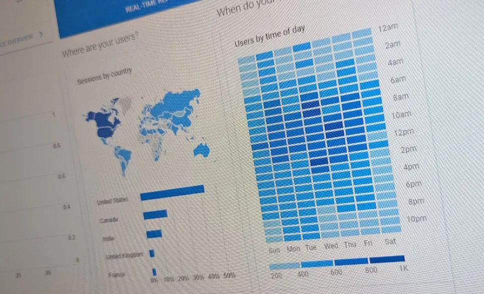
Good old Google Analytics 3 (Universal analytics) displayed a little chart on the “home” page that showed the time of day when visitors visited your website. It went by the name “Users by time of day”.
It was quite an understated little chart. The “home” page of GA3 was the only place it appeared. There was no detailed report, and it wasn’t a visualisation that was used anywhere else.
Despite being understated, it was a surprisingly useful and popular visualisation.
In the widget, you could choose a time period. The choices were 7 days, 30 days, 90 days and “custom” where you could select your own date range. On one axis was the time of day, on the other was the day of the week. Irrespective of what time period you selected, the result was a week-view visualisation.
The resulting grid was coloured in shades of blue depending on how many visits there had been during that particular hour of the week. If you hovered your mouse over a rectangle, it showed the actual number of “Users”.
In my experience, the "heat map" visualisation, that the "Users by time of day" chart used, was something that people could easily understand. It was straight forward.
Sure, with explorations in GA4 you can do other kinds of analysis using the same granularity of an hour, but there’s nothing in the standard reports that can reproduce this little GA3 chart.
Here are some examples of how it was useful:
- Judging when to release changes, time a “service window” or period of “downtime”.
- Timing social media posts, newsletters, or other campaigns and new content.
- Validating hypothesis or surfacing insights around visitor behaviour.
There were some limitations with this visualisation though.
One limitation was that the charts shown on the “home” page of GA3 couldn’t have any segmentation applied to them. Which meant you couldn’t use this to see underlying visitor patterns (such as if mobile have a different pattern to desktop).
Another limitation was that “users” was the only metric available for the chart. Again, this limited your ability to do any deeper analysis. It would have been useful, for example, to be able to change the chart to show conversions (or “key events” as goals are now called in GA4).
But enough nostalgia! Universal Analytics has gone, but let’s bring the “Users by time of day” chart back to life. Hold my hand, and I'll guide you through recreating this classic little chart using GA4 and Looker Studio.
How to recreate the chart
The ingredients you'll need for this recipe: Looker Studio, GA4, and some data!
I'm going to skip going through getting started with Looker Studio, creating a report, and adding a data connection. I'm making the bold presumption that you know how to do that already, or can search for another guide to help you!
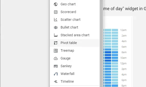
- First, from your GA4 connected report in Looker Studio, open the "insert" menu, add a pivot table to your page.
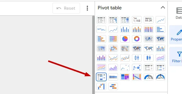
- The default pivot table isn't quite what we need though. So change it to be a pivot table with heatmap in the "chart" dropdown in the column to the right when you have the pivot table selected.
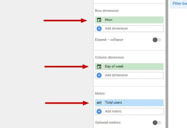
- In the "setup column", for the "Row dimension" add the Hour dimension.
For the "Column dimension" add the Day of week dimension.
Finally, for the "Metric" add the Total users metric.
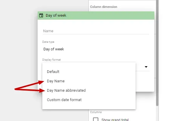
- Oddly, the default display format for Day of week in Looker Studio leaves Sunday as a "7". So click on the little calendar icon by the side of "Day of week" and choose Day Name, or Day Name abbreviated as the display format.
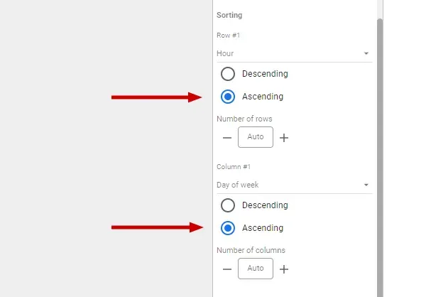
- Further down the setup column you'll find "Sorting".
For Row #1 select Hour and Ascending.
For Column #1 select Day of week and Ascending.
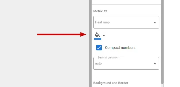
- If you'd like a different colour scale to the default blue, you can change the base colour by clicking on the "fill" icon by Metric #1 under the style column/tab.
Working example
If you want to see a working version, here is an example Looker Studio report that I've created for you to look at and to guide you.
It’s a pretty good match to the old one, but offers a number of improvements - Both of the limitations I mentioned earlier are gone!
We can choose an alternative metric for the chart, such as engaged sessions or conversions (now called, key events).
We can also apply additional criteria to the chart, so it’s possible to base the chart on characteristics such as device type, country, logged in visitors, a specific session source - you choose!
This Looker Studio report makes it really easy to visualise weekly patterns you might have in your analytics data. It’s also customisable and expandable. If a week view doesn’t suit your needs, why not adjust it into a month view, or a quarter?
If you haven’t used Looker Studio before, then it’s a good way of creating a custom report using Google Analytics data (or even data from many other sources; such as Matomo, spreadsheets, Google Search Console) that is stripped of all the unnecessary complication that a wider audience in your organisation may find confusing or intimidating.
A Looker Studio report can be a straight-forward and effective way to share insights, progress and results with your colleagues - without needing to give access and training to your actual analytics tool.